Book cover likes and dislikes
I think we all have those things we find really off-putting on covers, and things that draw us in so here are my top picks:
Best ones I know/have read:
Confess: this is a cover I really like and it's a prime example of all the elements I like: the title is bigger than the authors name, it's simplistic yet draws your attention and only when you look at the details do you see everything (unfortunately the details in this one is a hidden face)
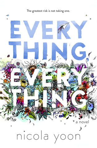
Everything, Everything: a similar story, when it comes to the cover, but a bit more busy. Same goes for Nicola Yoon's second book: The Sun is Also a Star. I especially love how the author's name look on the cover.
Stephanie Perkins: now these books I've talked about before and how aesthetically pleasing they are to me. The colors, the contrast and the message of the book is clear.
When it comes to classics I have a whole post about them and buying them, when it comes to all the different editions
link.
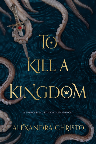
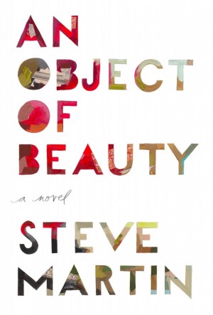
My picks may be on the boring side, but every once in a while something different picks my interest. These are ones I haven't read:
Read on lovelies,
S








No comments:
Post a Comment
I'm better reached via Instagram or email:
@booksonal
booksonal@gmail.com
Thanks for reading :)