Book cover likes and dislikes
I think we all have those things we find really off-putting on covers, and things that draw us in so here are the picks for my least favorites:
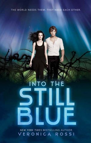
I really don't like it when the authors name is bigger than the title, but the thing is that's what sells - the name. Another think I usually don't like is people on the cover, especially photos of ones
Case in point:
 |
| link to book |
 |
| link to book |
Enigma: I've talked about this book before, not in the best light, but I mean that cover. I, yeah, I'm just gonna leave it at that.
City of Bones: You know what? I don't think I need to explain myself with any of these...
 |
| link to book |
 |
| link |
 |
| link to book |
Read on lovelies,
S
Also anyone else notice how my favorites had a color scheme of lightness and colors,
and on the other hand these are darker.


No comments:
Post a Comment
I'm better reached via Instagram or email:
@booksonal
booksonal@gmail.com
Thanks for reading :)